Copy Paste Fonts
Font Styles 4 min read Published
Aesthetic Text Styles: Build a Soft, Minimal or Dark Profile
Build a soft, minimal, dark, retro or playful profile with aesthetic text. Find original font-and-symbol pairings and copyable bio combinations.
By the Copy Paste Fonts team · Sources checked 21 October 2026
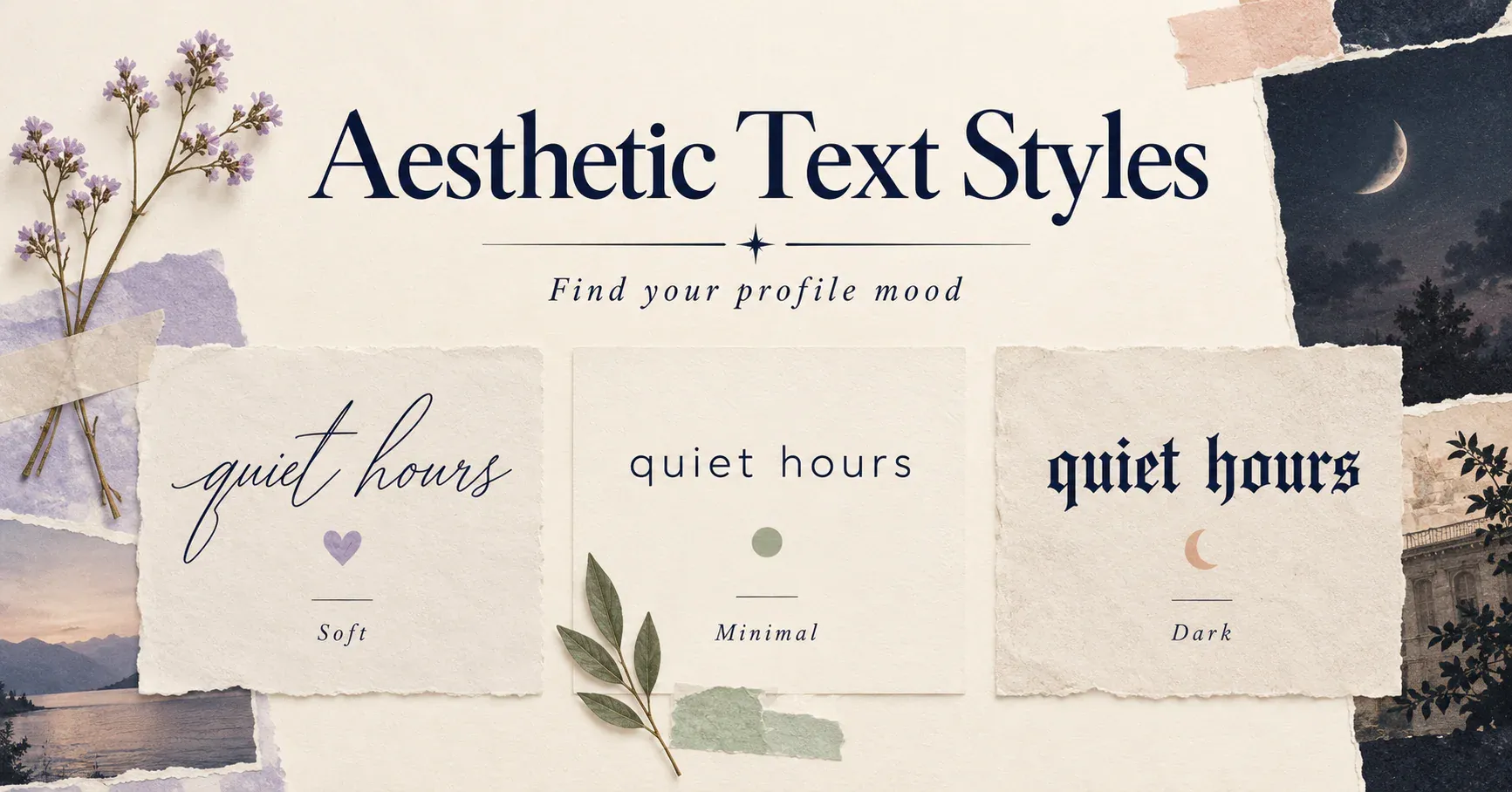
Aesthetic text works best when the lettering, spacing and symbols agree with one another. A flowing name beside a tiny heart feels different from the same name in angular blackletter. Neither needs a long string of decorations to establish a mood. Whether you call them aesthetic fonts or aesthetic text, you only need to copy and paste a few well-matched details.
Start with a phrase that belongs to your account, then change its treatment. In this guide, the phrase “quiet hours” becomes a small collection of profile ideas. You can copy the examples or replace the words with your own.
Three choices that shape the look
Letter shape gives the text its voice. Script can suggest a handwritten note, bold letters give a heading more weight, and blackletter introduces an angular, dramatic texture.
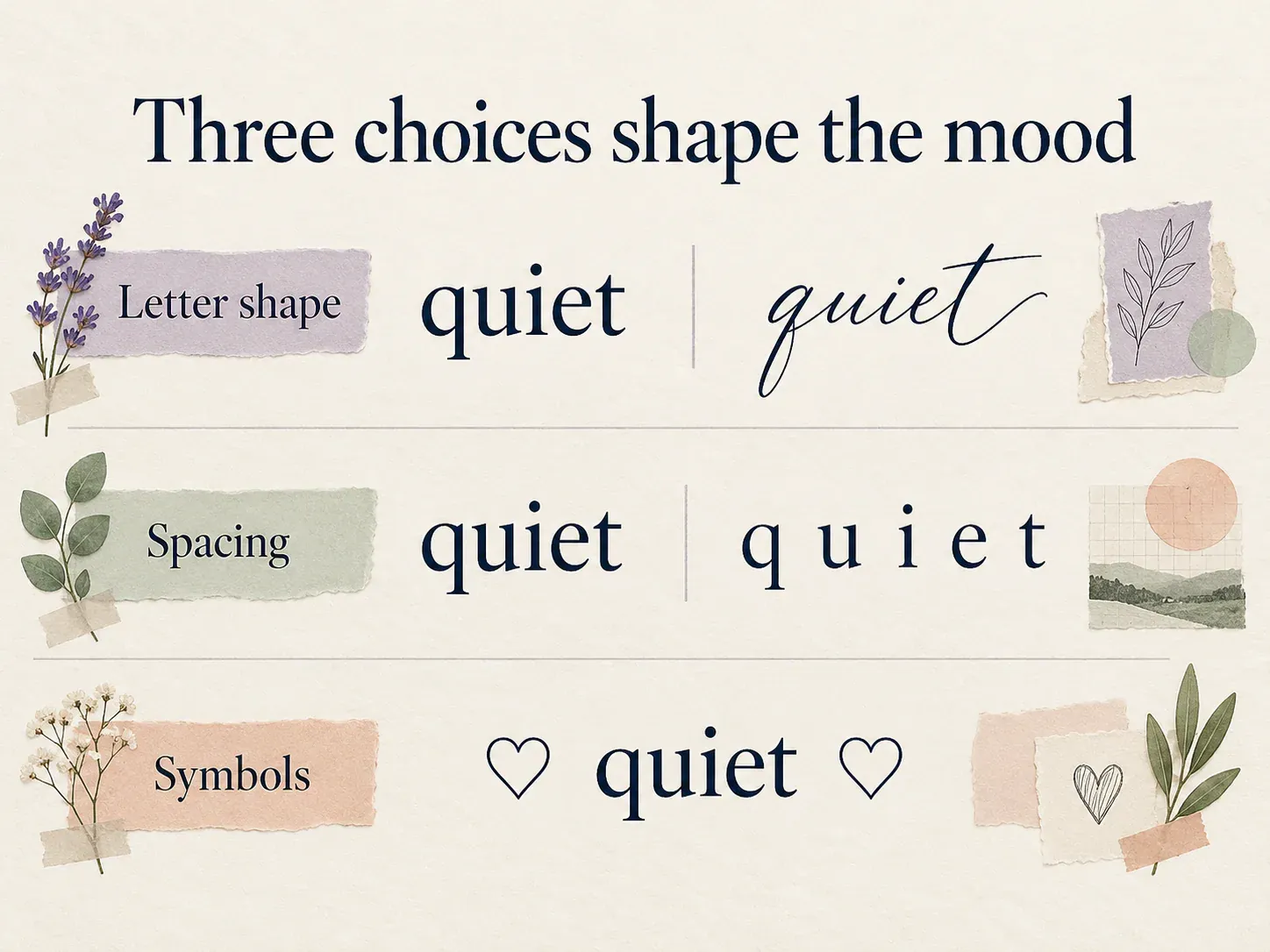
Spacing controls how crowded or open the line feels. Compare quiet hours with quiet hours. The fullwidth characters create a broader visual rhythm, even before any extra spaces are added.
Symbols add a small theme. A heart, star, moon or simple dot can finish a line. Choose a symbol because it fits the words rather than because a profile feels unfinished without more decoration.
These are design choices, not fixed rules. A reading account can be bright and playful; a gaming account can be minimal. Choose the combination that matches your content.
Five moods with copyable starting points
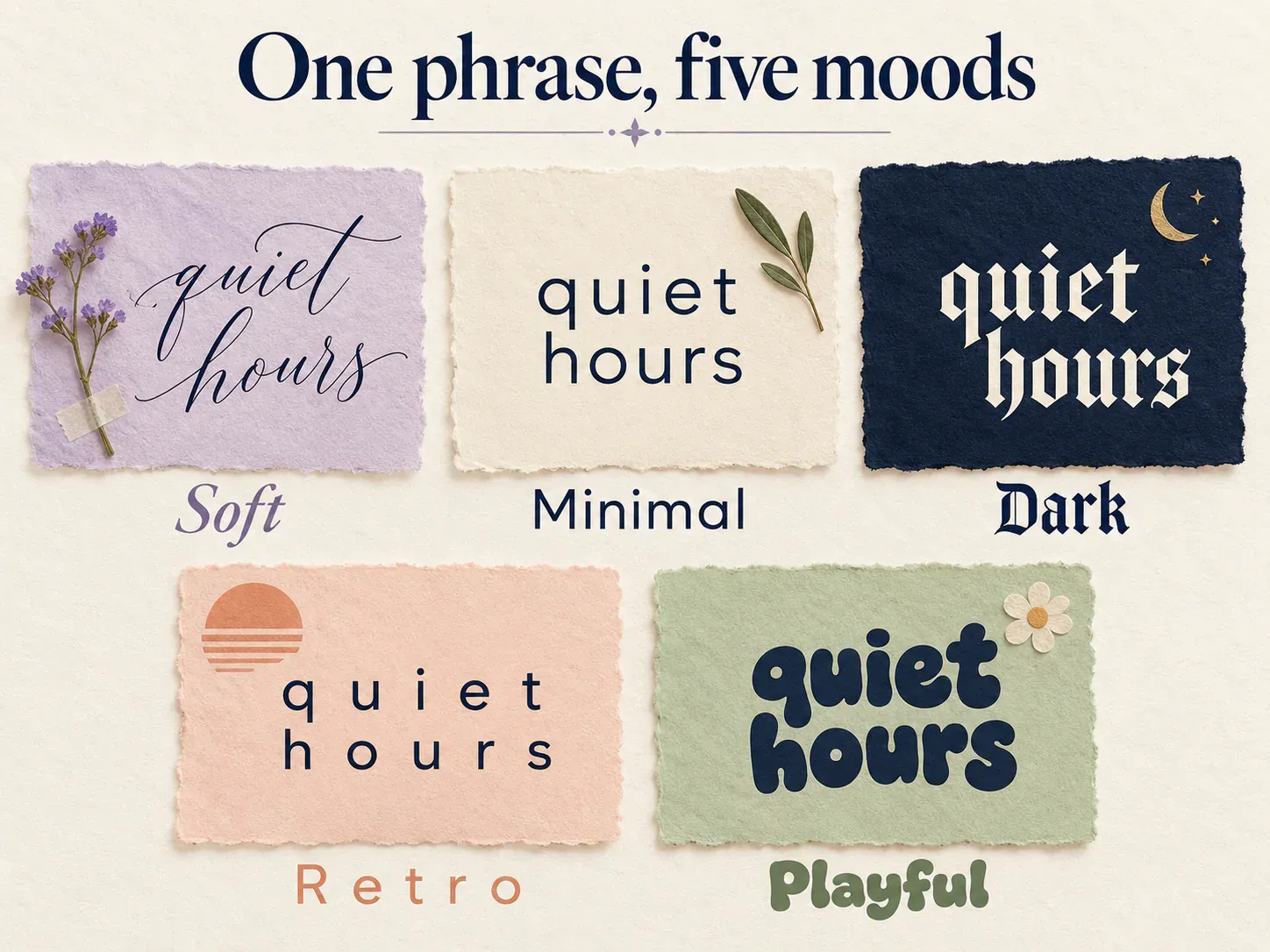
Soft: light lettering and a small accent
Example:
♡ 𝓺𝓾𝓲𝓮𝓽 𝓱𝓸𝓾𝓻𝓼
Sketches, tea and unhurried afternoons
The script line supplies the decoration, while the second line explains the account. Try this treatment for an art journal, personal scrapbook or collection of everyday photographs.
Alternative:
quiet hours ♡
Little things worth keeping
You can keep the soft mood while leaving every letter ordinary. The wording and a single heart do much of the work.
Minimal: ordinary text and deliberate separators
Example:
quiet hours
notes · objects · places
Alternative:
QUIET HOURS
A small record of ordinary days
Minimal does not have to mean tiny text. It can mean fewer competing decisions: one case treatment, one separator and a clear description. Try ordinary lowercase before switching to a small-cap alphabet; the simpler version may already suit the profile.
Dark: one strong blackletter line
Example:
𝔮𝔲𝔦𝔢𝔱 𝔥𝔬𝔲𝔯𝔰
Old books • ink drawings • late walks
Alternative:
☾ quiet hours
Stories from after sunset
The first treatment gets its character from the letter shapes. The second uses a moon and descriptive wording. For a short name, either can create a darker mood without adding marks above and below every letter.
Retro: wide letters with simple supporting text
Example:
quiet hours
Night drives and forgotten playlists
Alternative:
after hours
Film photos from the long way home
Fullwidth lettering occupies more horizontal room, so keep the headline short. If it breaks onto an awkward second line, shorten the words rather than squeezing in invisible spacing tricks.
Playful: rounded letters and direct wording
Example:
ⓠⓤⓘⓔⓣ ⓗⓞⓤⓡⓢ
Tiny doodles, big snack opinions
Alternative:
✿ quiet hours ✿
Drawing one happy thing each day
Round enclosed letters can make a short title feel cheerful. A flower frame gives another option while keeping the name in ordinary text. Pick one treatment for the name and let the description carry the rest of the personality.
Build a combination that is yours
Write a plain version first. Describe what someone will find on the account in a sentence they can understand without looking at the profile picture.
Next, choose one word or line to emphasise. This might be your name, a project title or a short phrase. Try it in the aesthetic fonts generator and compare the available results.
Then pair it with a calmer supporting line. If the headline is elaborate, leave the explanation plain. If the headline is ordinary, a small accent or consistent separator may be enough.
Finally, remove anything that does not add meaning. Three similar stars do not necessarily make a stronger design than one well-placed star. A profile should be recognisable at a glance, not only when someone studies every symbol.
Use the same idea in different places
Your profile name can carry the main style. In a caption, use just a short heading or a recurring symbol. For a reply, ordinary text with the same small accent can feel connected to the profile without becoming elaborate.
For example, an account using the soft “quiet hours” layout might post:
♡ this week's sketchbook
Three unfinished drawings and one page I finally like.
A minimal version could be:
This week's sketchbook
Three drawings. One afternoon. Plenty left to learn.
The identity comes from repeating a small set of choices. You do not have to paste the entire bio style into every comment.
Check the text where it will live
Copyable styling uses characters rather than a portable font file. Apps draw those characters with the fonts they have available, so their appearance can vary. [1] Review the result on the actual profile, especially if the name mixes ordinary letters, symbols and a decorative alphabet.
Keep names, contact details and important instructions easy to recognise. If a decorative character is hard to read, replace it with ordinary text. This is a design edit: the aim is to preserve the mood while helping the reader understand the message.
Start with your own phrase in the aesthetic fonts generator. Choose the version that fits the account you are making, then build the surrounding words around it.
Ready to try it?
Open Aesthetic Fonts